Template:ItemBox/doc: Difference between revisionsGive feedback
mNo edit summary |
Add a Low graphics example showing normal vs lowGraphics cards side by side across tiers and slots (with help from vergir-bot LLM) |
||
| (One intermediate revision by one other user not shown) | |||
| Line 30: | Line 30: | ||
"showTierTag": { | "showTierTag": { | ||
"description": "Set to true to show the tier corner badge.", | "description": "Set to true to show the tier corner badge.", | ||
"type": "boolean", | |||
"suggestedvalues": ["true", "false"] | |||
}, | |||
"lowGraphics": { | |||
"description": "Set to true for pages that place many cards at once (the card navboxes). Swaps the paper texture to a cacheable overlay so scrolling stays smooth; the look is nearly identical.", | |||
"type": "boolean", | "type": "boolean", | ||
"suggestedvalues": ["true", "false"] | "suggestedvalues": ["true", "false"] | ||
| Line 75: | Line 80: | ||
}, | }, | ||
"paramOrder": [ | "paramOrder": [ | ||
"itemName", "size", "showTierTag", | "itemName", "size", "showTierTag", "lowGraphics", | ||
"overrideDisplayName", "overrideTier", "overrideSlot", | "overrideDisplayName", "overrideTier", "overrideSlot", | ||
"overrideIsActive", "overrideIsImbue", | "overrideIsActive", "overrideIsImbue", | ||
| Line 126: | Line 131: | ||
{{ItemBox|Extended Magazine}} | {{ItemBox|Extended Magazine}} | ||
{{ItemBox|Extended Magazine|size = 1.5}} | {{ItemBox|Extended Magazine|size = 1.5}} | ||
=== Low graphics === | |||
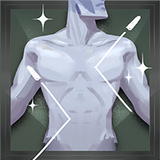
For pages that place many cards at once. The paper texture becomes a single cacheable overlay so scrolling stays smooth; the look is nearly identical. | |||
<pre> | |||
{{ItemBox|Extra Health}} | |||
{{ItemBox|Kinetic Dash}} | |||
{{ItemBox|Metal Skin}} | |||
{{ItemBox|Echo Shard}} | |||
{{ItemBox|Extra Health|lowGraphics = true}} | |||
{{ItemBox|Kinetic Dash|lowGraphics = true}} | |||
{{ItemBox|Metal Skin|lowGraphics = true}} | |||
{{ItemBox|Echo Shard|lowGraphics = true}} | |||
</pre> | |||
'''Normal'''<br> | |||
{{ItemBox|Extra Health}} | |||
{{ItemBox|Kinetic Dash}} | |||
{{ItemBox|Metal Skin}} | |||
{{ItemBox|Echo Shard}} | |||
'''Low graphics'''<br> | |||
{{ItemBox|Extra Health|lowGraphics = true}} | |||
{{ItemBox|Kinetic Dash|lowGraphics = true}} | |||
{{ItemBox|Metal Skin|lowGraphics = true}} | |||
{{ItemBox|Echo Shard|lowGraphics = true}} | |||
=== Overrides === | === Overrides === | ||
Latest revision as of 10:14, 25 July 2026

Usage
[edit source]{{ItemBox}} renders a Deadlock shop item as a card: icon, tier art, and the item name auto-sized to fit. Pass an item name and everything else — tier, slot, tags, image — is pulled from Module:ItemData.
{{ItemBox|Extended Magazine}}
Parameters
[edit source]| Parameter | Description | Type | Status | |
|---|---|---|---|---|
| itemName | itemName 1 | Item name; keys into Module:ItemData. Positional.
| String | required |
| size | size | Scales the whole card. 1 = default (80px wide), 1.5 = 150%, 0.75 = 75%.
| Number | optional |
| showTierTag | showTierTag | Set to true to show the tier corner badge.
| Boolean | optional |
| lowGraphics | lowGraphics | Set to true for pages that place many cards at once (the card navboxes). Swaps the paper texture to a cacheable overlay so scrolling stays smooth; the look is nearly identical.
| Boolean | optional |
| overrideDisplayName | overrideDisplayName | Replaces the name shown on the card.
| String | optional |
| overrideTier | overrideTier | Replaces the card's tier.
| Number | optional |
| overrideSlot | overrideSlot | Replaces the card's background (type).
| String | optional |
| overrideIsActive | overrideIsActive | Forces the ACTIVE tag on or off.
| Boolean | optional |
| overrideIsImbue | overrideIsImbue | Forces the IMBUE tag on or off.
| Boolean | optional |
| overrideLinkTooltip | overrideLinkTooltip | Page the hover tooltip reads its info from.
| String | optional |
| overrideLinkImage | overrideLinkImage | Page/file the icon image comes from.
| String | optional |
| overrideLinkClick | overrideLinkClick | Page the card links to when clicked.
| String | optional |
Examples
[edit source]Basic
[edit source]{{ItemBox|Close Quarters}}
{{ItemBox|Spirit Shredder Bullets}}
{{ItemBox|Silencer}}
{{ItemBox|Extra Health}}
{{ItemBox|Echo Shard}}
{{ItemBox|Celestial Blessing}}




Tier tag
[edit source]{{ItemBox|Extended Magazine|showTierTag = true}}
{{ItemBox|Berserker|showTierTag = true}}
{{ItemBox|Echo Shard|showTierTag = true}}
{{ItemBox|Celestial Blessing|showTierTag = true}}
Size
[edit source]{{ItemBox|Extended Magazine|size = 0.75}}
{{ItemBox|Extended Magazine}}
{{ItemBox|Extended Magazine|size = 1.5}}
Low graphics
[edit source]For pages that place many cards at once. The paper texture becomes a single cacheable overlay so scrolling stays smooth; the look is nearly identical.
{{ItemBox|Extra Health}}
{{ItemBox|Kinetic Dash}}
{{ItemBox|Metal Skin}}
{{ItemBox|Echo Shard}}

{{ItemBox|Extra Health|lowGraphics = true}}
{{ItemBox|Kinetic Dash|lowGraphics = true}}
{{ItemBox|Metal Skin|lowGraphics = true}}
{{ItemBox|Echo Shard|lowGraphics = true}}
Normal

Low graphics
Overrides
[edit source]{{ItemBox|High-Velocity Rounds|overrideDisplayName = Test Name}}
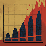
{{ItemBox|Intensifying Magazine|overrideTier = 4}}
{{ItemBox|Weakening Headshot|overrideSlot = Spirit}}
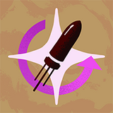
{{ItemBox|Recharging Rush|overrideIsActive = true}}
{{ItemBox|Alchemical Fire|overrideIsImbue = true}}
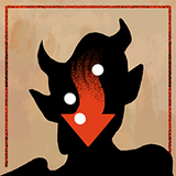
{{ItemBox|Bullet Lifesteal|overrideLinkClick = Heroes}}


References
[edit source]- Item data — Data:ItemData.json, read by Module:ItemData
- Name sizing and texture variety — Module:ItemBox
- Card styling — Template:ItemBox/styles.css