Template:ItemBox: Difference between revisionsGive feedback
Add texture=blend and blend1/2/3 modes, and give lowGraphics the cacheable blended paper instead of no texture (with help from vergir-bot LLM) |
Fix texture=blend: use the item's hashed texture variant rather than an undefined variable (with help from vergir-bot LLM) |
||
| Line 39: | Line 39: | ||
no - drop it entirely | no - drop it entirely | ||
1/2/3 - one shared paper via the mix-blend overlay (does not cache) | 1/2/3 - one shared paper via the mix-blend overlay (does not cache) | ||
blend - paper multiplied into the card art, per item, cacheable | blend - paper multiplied into the card art, per item, cacheable. The paper | ||
blend1/blend2/blend3 - the cacheable blend | image is picked up from the item's texture-vN variant class. | ||
-->{{#vardefine:lite|{{#switch:{{{wearMask|}}}|no=itembox-flat-wear|ramp=itembox-ramp-wear|soft=itembox-soft-wear}} {{#ifeq:{{{iconMask|}}}|no|itembox-flat-icon}} {{#switch:{{{texture|}}}|no=itembox-no-texture|1=itembox-force-tex-1|2=itembox-force-tex-2|3=itembox-force-tex-3|blend=itembox-blend-texture | blend1/blend2/blend3 - the cacheable blend forced to one shared paper | ||
-->{{#vardefine:lite|{{#switch:{{{wearMask|}}}|no=itembox-flat-wear|ramp=itembox-ramp-wear|soft=itembox-soft-wear}} {{#ifeq:{{{iconMask|}}}|no|itembox-flat-icon}} {{#switch:{{{texture|}}}|no=itembox-no-texture|1=itembox-force-tex-1|2=itembox-force-tex-2|3=itembox-force-tex-3|blend=itembox-blend-texture|blend1=itembox-blend-texture itembox-blend-tex-1|blend2=itembox-blend-texture itembox-blend-tex-2|blend3=itembox-blend-texture itembox-blend-tex-3}}}}<!-- | |||
Links. | Links. | ||
Revision as of 20:16, 24 July 2026

Usage
{{ItemBox}} renders a Deadlock shop item as a card: icon, tier art, and the item name auto-sized to fit. Pass an item name and everything else — tier, slot, tags, image — is pulled from Module:ItemData.
{{ItemBox|Extended Magazine}}
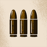
Parameters
| Parameter | Description | Type | Status | |
|---|---|---|---|---|
| itemName | itemName 1 | Item name; keys into Module:ItemData. Positional.
| String | required |
| size | size | Scales the whole card. 1 = default (80px wide), 1.5 = 150%, 0.75 = 75%.
| Number | optional |
| showTierTag | showTierTag | Set to true to show the tier corner badge.
| Boolean | optional |
| lowGraphics | lowGraphics | Set to true for pages that place many cards at once (the card navboxes). Swaps the paper texture to a cacheable overlay so scrolling stays smooth; the look is nearly identical.
| Boolean | optional |
| overrideDisplayName | overrideDisplayName | Replaces the name shown on the card.
| String | optional |
| overrideTier | overrideTier | Replaces the card's tier.
| Number | optional |
| overrideSlot | overrideSlot | Replaces the card's background (type).
| String | optional |
| overrideIsActive | overrideIsActive | Forces the ACTIVE tag on or off.
| Boolean | optional |
| overrideIsImbue | overrideIsImbue | Forces the IMBUE tag on or off.
| Boolean | optional |
| overrideLinkTooltip | overrideLinkTooltip | Page the hover tooltip reads its info from.
| String | optional |
| overrideLinkImage | overrideLinkImage | Page/file the icon image comes from.
| String | optional |
| overrideLinkClick | overrideLinkClick | Page the card links to when clicked.
| String | optional |
Examples
Basic
{{ItemBox|Close Quarters}}
{{ItemBox|Spirit Shredder Bullets}}
{{ItemBox|Silencer}}
{{ItemBox|Extra Health}}
{{ItemBox|Echo Shard}}
{{ItemBox|Celestial Blessing}}

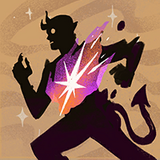
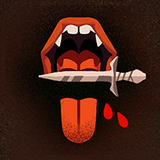
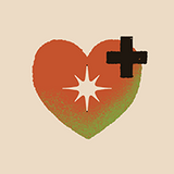
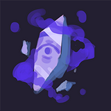

Tier tag
{{ItemBox|Extended Magazine|showTierTag = true}}
{{ItemBox|Berserker|showTierTag = true}}
{{ItemBox|Echo Shard|showTierTag = true}}
{{ItemBox|Celestial Blessing|showTierTag = true}}
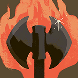
Size
{{ItemBox|Extended Magazine|size = 0.75}}
{{ItemBox|Extended Magazine}}
{{ItemBox|Extended Magazine|size = 1.5}}
Low graphics
For pages that place many cards at once. The paper texture becomes a single cacheable overlay so scrolling stays smooth; the look is nearly identical.
{{ItemBox|Extra Health}}
{{ItemBox|Kinetic Dash}}
{{ItemBox|Metal Skin}}
{{ItemBox|Echo Shard}}

{{ItemBox|Extra Health|lowGraphics = true}}
{{ItemBox|Kinetic Dash|lowGraphics = true}}
{{ItemBox|Metal Skin|lowGraphics = true}}
{{ItemBox|Echo Shard|lowGraphics = true}}
Normal

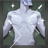
Low graphics
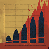
Overrides
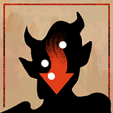
{{ItemBox|High-Velocity Rounds|overrideDisplayName = Test Name}}
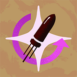
{{ItemBox|Intensifying Magazine|overrideTier = 4}}
{{ItemBox|Weakening Headshot|overrideSlot = Spirit}}
{{ItemBox|Recharging Rush|overrideIsActive = true}}
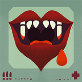
{{ItemBox|Alchemical Fire|overrideIsImbue = true}}
{{ItemBox|Bullet Lifesteal|overrideLinkClick = Heroes}}


References
- Item data — Data:ItemData.json, read by Module:ItemData
- Name sizing and texture variety — Module:ItemBox
- Card styling — Template:ItemBox/styles.css