Template:WeaponCard: Difference between revisionsGive feedback
Jump to navigation
Jump to search
Gammaton32 (talk | contribs) adjusted font weight to be more accurate |
adding classes to everything ready for templatestyles! |
||
| Line 9: | Line 9: | ||
<div class="weaponcard-container" style="width:570px; font-family: 'Retail Demo','Open Sans',serif; color:#ffefd7"> | <div class="weaponcard-container" style="width:570px; font-family: 'Retail Demo','Open Sans',serif; color:#ffefd7"> | ||
<div class="weapon-display" style="width:100%;display:inline-flex; height:150px; overflow:hidden; border-radius:5px 5px 0 0"> | <div class="weapon-display" style="width:100%;display:inline-flex; height:150px; overflow:hidden; border-radius:5px 5px 0 0"> | ||
<div class="name-stats-container" style="width:auto; display:flex; flex-direction:column; padding:20px 15px | <div class="name-stats-container" style="width:auto; display:flex; flex-direction:column; padding:20px 15px; gap:5px"> | ||
<div style="font-size:24px">'''{{{weapon_name|{{#invoke:HeroData|get_hero_var|{{#var:hero_key_or_en}}|NameKey|true}}}}}'''</div> | <div class="weapon-name" style="font-size:24px">'''{{{weapon_name|{{#invoke:HeroData|get_hero_var|{{#var:hero_key_or_en}}|NameKey|true}}}}}'''</div> | ||
<div style="display:flex; gap:10px; min-width: fit-content; flex-wrap: wrap; justify-content: center;"> | <div class="weapon-type-container" style="display:flex; gap:10px; min-width: fit-content; flex-wrap: wrap; justify-content: center;"> | ||
<div style="padding:3px 5px; border-radius:5px; background:#0000005c">{{#invoke:HeroData|get_list_elem|{{#var:hero_key_or_en}}|WeaponTypes|1|true}}</div> | <div class="weapon-type" style="padding:3px 5px; border-radius:5px; background:#0000005c">{{#invoke:HeroData|get_list_elem|{{#var:hero_key_or_en}}|WeaponTypes|1|true}}</div> | ||
{{#if:{{#invoke:HeroData|get_list_elem|{{#var:hero_key_or_en}}|WeaponTypes|2|true}} | {{#if:{{#invoke:HeroData|get_list_elem|{{#var:hero_key_or_en}}|WeaponTypes|2|true}} | ||
|<div style="padding:3px 5px; border-radius:5px; background:#0000005c">{{#invoke:HeroData|get_list_elem|{{#var:hero_key_or_en}}|WeaponTypes|2|true}}</div> | |<div class="weapon-type" style="padding:3px 5px; border-radius:5px; background:#0000005c">{{#invoke:HeroData|get_list_elem|{{#var:hero_key_or_en}}|WeaponTypes|2|true}}</div> | ||
|}}<!-- | |}}<!-- | ||
-->{{#if:{{#invoke:HeroData|get_list_elem|{{#var:hero_key_or_en}}|WeaponTypes|3|true}} | -->{{#if:{{#invoke:HeroData|get_list_elem|{{#var:hero_key_or_en}}|WeaponTypes|3|true}} | ||
|<div style="padding:3px 5px; border-radius:5px; background:#0000005c">{{#invoke:HeroData|get_list_elem|{{#var:hero_key_or_en}}|WeaponTypes|3|true}}</div> | |<div class="weapon-type" style="padding:3px 5px; border-radius:5px; background:#0000005c">{{#invoke:HeroData|get_list_elem|{{#var:hero_key_or_en}}|WeaponTypes|3|true}}</div> | ||
|}} | |}} | ||
</div></div> | </div></div> | ||
Revision as of 22:07, 2 April 2026

This template uses CSS found at WeaponCard/styles.css.
Usage
This template displays weapon stats.
Recommended to use key parameter for hero key instead of an unnamed 1st parameter of the english hero name. This allows localizing it to the current language in O(1) time complexity, as opposed to O(N).
Examples
{{WeaponCard|Dynamo}}

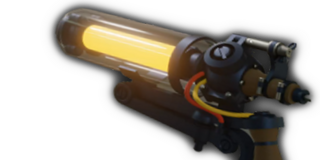
{{WeaponCard|key=hero_forge}}

Increases fire rate as the guns spins up
{{WeaponCard|key=hero_forge|weapon_name=Test Weapon}}
Increases fire rate as the guns spins up
{{WeaponCard|key=hero_forge|weapon_name=Test Weapon|no_description=true}}
No description.
| Parameter | Description | Type | Status | |
|---|---|---|---|---|
| 1 | 1 | no description | Unknown | optional |
| key | key | no description | Unknown | optional |
| ph | ph | no description | Unknown | optional |
| weapon_name | weapon_name | In case the weapon name is different from the files | Unknown | optional |
| no_description | no_description | Remove description
| Boolean | optional |
| no_falloff | no_falloff | Weapons with no damage falloff (Celeste)
| Boolean | optional |