Template:Hero Navbox: Difference between revisionsGive feedback
Jump to navigation
Jump to search
m default text size 11px to 10px |
m forward lang_code parameter |
||
| Line 10: | Line 10: | ||
|sticker_size={{{sticker_size|30}}} | |sticker_size={{{sticker_size|30}}} | ||
|herolabs_text_size={{{herolabs_text_size|6}}} | |herolabs_text_size={{{herolabs_text_size|6}}} | ||
|lang_code={{{lang_code|en}}} | |||
}} | }} | ||
</div> | </div> | ||
| Line 25: | Line 26: | ||
|sticker_size={{{sticker_size|30}}} | |sticker_size={{{sticker_size|30}}} | ||
|herolabs_text_size={{{herolabs_text_size|6}}} | |herolabs_text_size={{{herolabs_text_size|6}}} | ||
|lang_code={{{lang_code|en}}} | |||
}} | }} | ||
</div> | </div> | ||
|}</includeonly><noinclude>{{Documentation}}</noinclude> | |}</includeonly><noinclude>{{Documentation}}</noinclude> | ||
Revision as of 23:30, 22 January 2025

This template uses CSS found at Hero Navbox/styles.css.
Usage
This navbox template displays Heroes, and should be added at the end of the page.
It appears at the bottom of individual hero pages like Abrams and on the home page.
The code for cards is at Template:Hero card2.
Examples
Default parameters for a smaller navbox:
{{Hero Navbox}}
| Heroes |
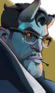
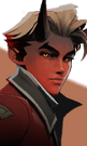

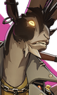
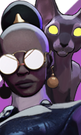
















| Hero Labs |
Specific parameters for a bigger navbox:
{{Hero Navbox|text_size=16|card_size=132}}
| Heroes |


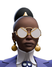


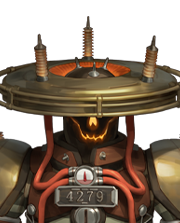


| Hero Labs |
| Parameter | Description | Type | Status | |
|---|---|---|---|---|
| Text Size | text_size | Size of the text on the card. Dont put 'px' at the end.
| Number | optional |
| Card Size | card_size | Size of the hero card. Dont put 'px' at the end
| Number | optional |